Private ScHOOL
Landing page
A private school aimed at families supporting children with disabilities needed a landing / one-page before launch to display course information for future clients and funding.
The site would require creating a brand identity that aligns with their values, and would need to simply and clearly communicate a lot of textual information to users.
This project would serve as a basis for a more complex full-site to be created further down the road.
∙ Wireframes & Ideation
∙ Animation & Motion Graphics
∙ Graphics and I
∙ Front End Development in Webflow
Ideation
The client wanted to create a visual identity for the micro-site which would reflect the branding of the 'include me in your school' ideology.
The logo was already created (above) and featured 6 bright colours in the shape of a hand-print.
I had to create a colour scheme which would fit with the identity suggested by the logo.
I created inspiration boards with imagery to help define the company. It had to be fun, inclusive and yet get the information across as efficiently as possible.
Development
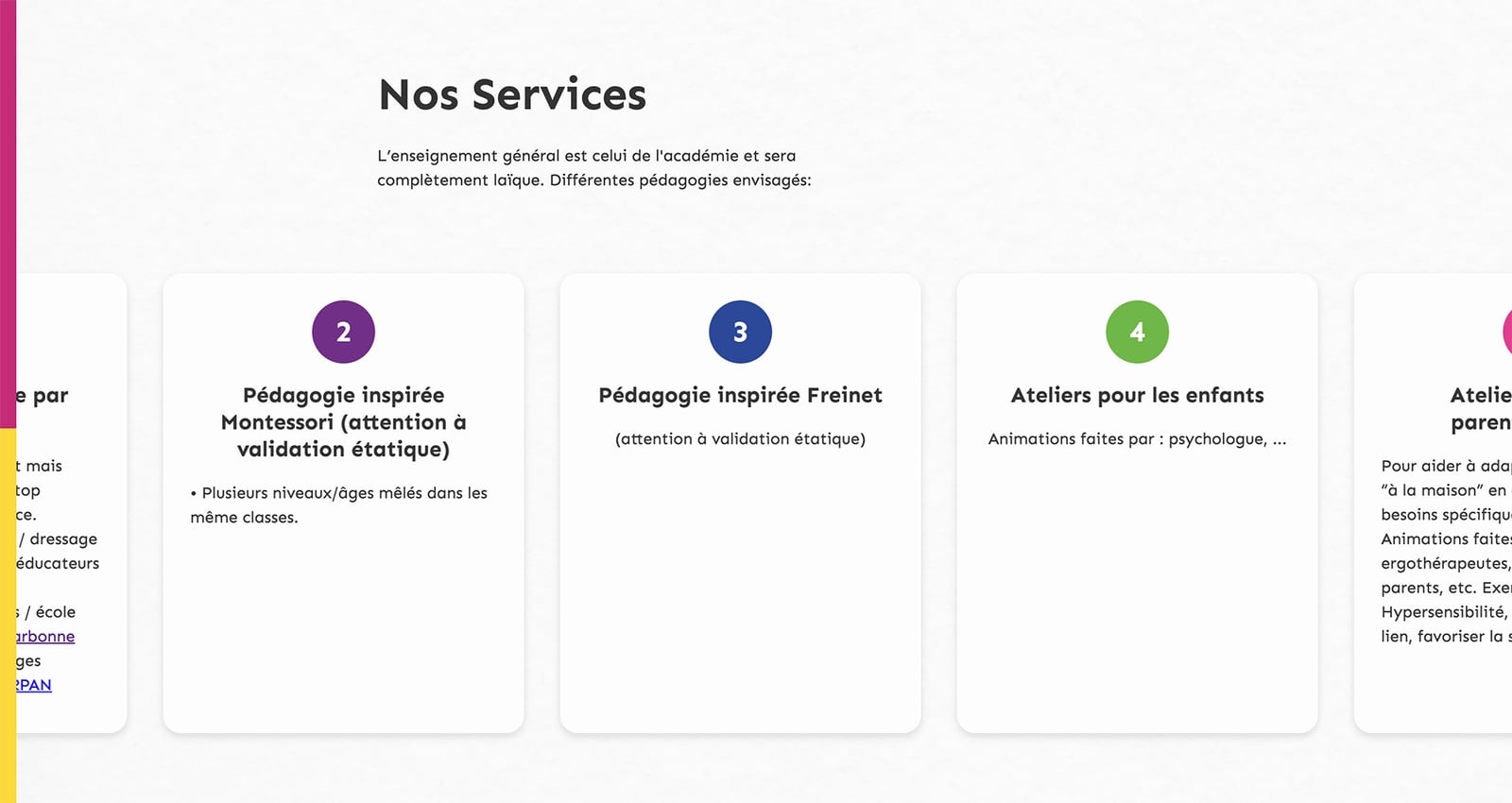
Based on the company's manifesto, I had to turn a long text document into a one-page design.
It was important the the content take priority as the landing page would be used for future investment opportunities and stakeholders.
Separating the content into sections based on subject matter, I could then establish styling for each part - visually distinguishing each section and making the content easier to digest.
To improve the experience, I added a progress bar to the final site to guide the user through the one-page content.
Challenges
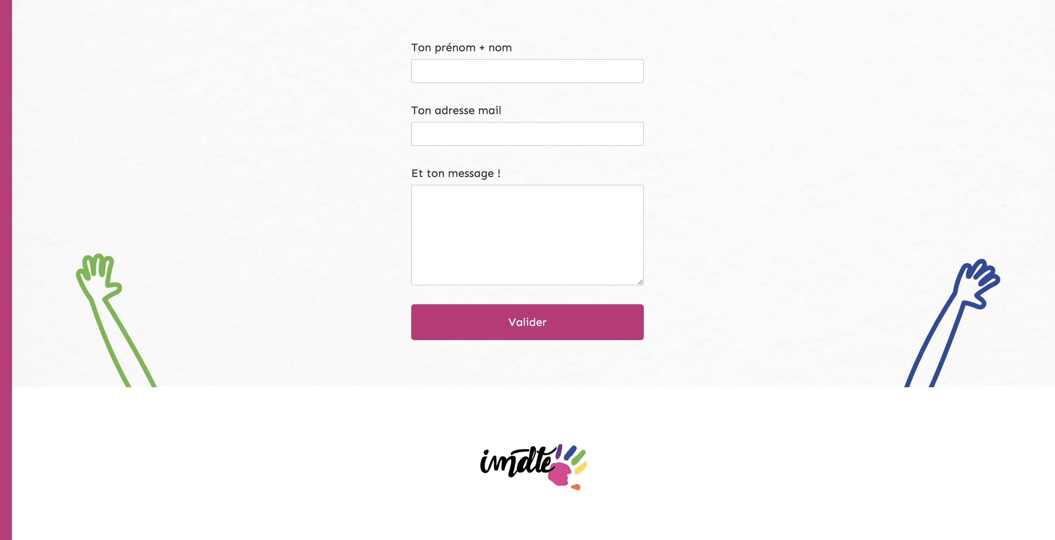
To give the site some personality and identity that would fit with the idea of inclusion, I designed hands that would wave to the user, symbolising the children waving for attention.
After sketching and refining in Adobe Illustrator, I imported in to After Effects, animating the wave and exporting using the Bodymovin plugin to create Lottie animations. Using different timings and colours to make a varied background of waves (below)
Outcome
The site functions as a base for the identity of the new company and the client was very happy with the imagery and overall look and feel for this one-page.
The information required has been broken down and reads better than the text document it originated from.
Going forward it would require a massive overhaul to the site's structural hierarchy and redefining the site map to improve the web site experience, but some graphical elements could be used from this project to create a full branding package.