Online Courses
Branding & Site Design
The client required a branding makeover to keep up with competition.
They wanted something more modern, punchy and bold to give them a vibrant energetic identity.
∙ Website Design
∙ Logo Design
∙ Social Media Banners
Research
Competitor analysis was completed to determine design trends.
Ideas were developed at this stage on establishing information hierarchy, colour schemes, and typography.
Design & Feedback
Bold bright purple was selected as the primary colour for the branding, on a professional and neutral white background.
I paired this with a modern sans-serif typeface that would give a professional and modern look to the site, whilst keeping good design choices in contrast for clarity and accessibility.
Yellow was paired with this colour choice to act as a bright compliment to use for CTA buttons and secondary styling.
The initial designs are sent to the client, and discussed over video call discuss the design choices and business goals, then further designs redeveloped for another review and exchange.
Challenges
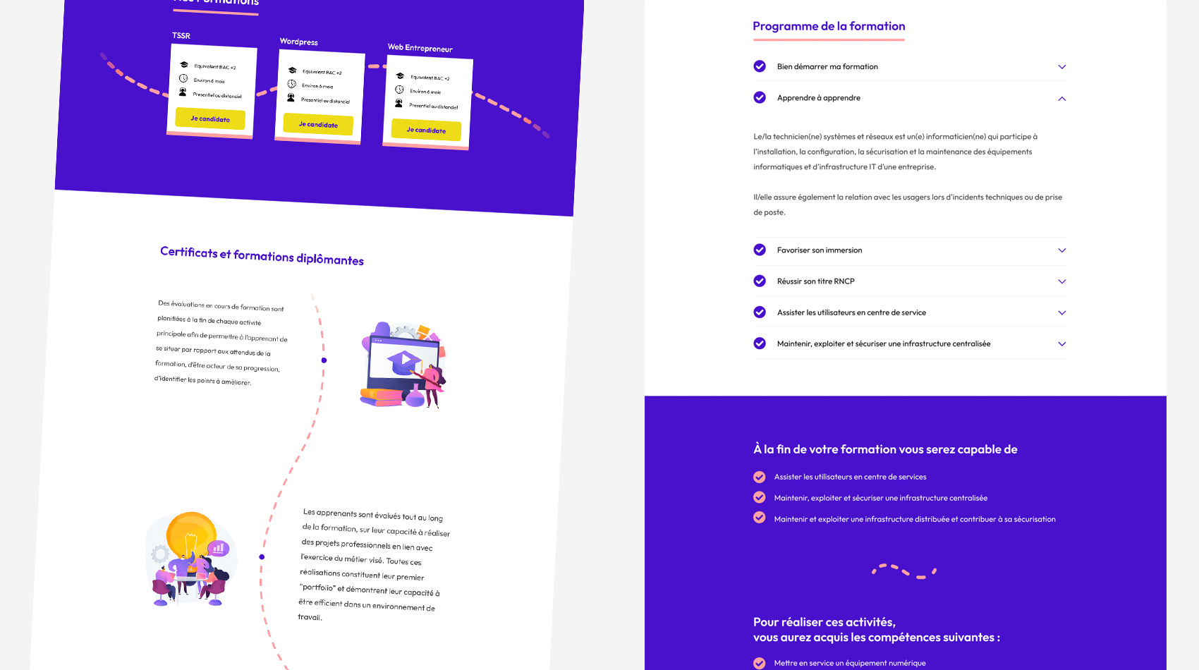
The client needed to communicate a lot of text-based information to the user, to give the necessary detail about the courses available.
To avoid too much visual noise, and make the content more palatable, Different layouts were created to distinguish each sub section from one another and make the content more visually appealling.
To further aid the flow of content, I created a dotted arrow theme with SVG vector images, that would lead the eye of the user from section to section.

Spotlight
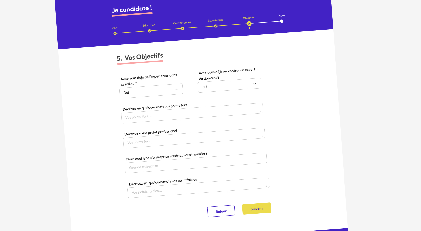
The principal goal of the site was to encourage sign ups to the client's courses.
The process of signing up currently involved asking for a lot of information from the user, taking them through steps of the sign up process.
To improve this, I created a progress bar to signal the steps required as an overview to the user. Existing sections were condensed together where information types were similar.
This reduced the amount of overall steps required by 30%. The progress bar aims to reduce the abandon rate as they now see how far they are in the application process.
Logo & Socials
As the client was happy with the rebranding of the site, they asked for a new logo and branding package for their social networks based on this new design.
I continued the research on competitors, this time focusing on logo-marks and social networks. It made sense to create a logo that would work well as a circle or a square for social media profiles and be legible on mobile devices - so not too much text!